
Illustration · 8 min read
Types of illustration - part I
The first part of the guide to types of illustration - photography as illustration, realistic illustrations, diagrams and technical illustrations.
· Anna Karwala
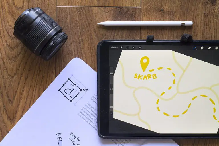
When we say “illustration”, we often mean different things. Illustrations are used mainly in adverts, textbooks, various signage systems. Although their goal is often to simplify reality, narrative techniques take precedence over painterly methods. In this first part of the guide I’ll show you the categories of illustration in which the practical function dominates over artistic expression.
What illustration actually is
Before we get into classification, it’s worth pausing for a moment on the concept itself. Illustration is a visual presentation of content - that’s the textbook definition. In practice the word covers an enormous range of work - from product photography in a catalogue, through drawings in a biology textbook, to artistic boards for the wall.
The common denominator? Function. An illustration always makes something visible - text, an idea, a product, an instruction, an emotion. This sets it apart from pure art, which can exist for its own sake. Illustration always has an addressee and always communicates something to them.
From this difference flows everything else. The illustrator works to the client’s brief. The artist works to their own vision. This doesn’t mean the illustrator is less creative - on the contrary, they work within constraints that force greater inventiveness. With full freedom, it’s easy to do anything. With a client’s brief and a ten-page text to illustrate, you have to find solutions that others would overlook.
Photography as illustration
It sounds paradoxical - photography as illustration? And yet. Illustrations serve as visual representations - practical and informative. Photography fits this role great, especially in:
- travel guides
- school textbooks
- educational materials
- product catalogues
- press and blog articles
- scientific reports
- historical documentation
Hyperrealistic drawings in this role would be redundant - they’d require photographic references anyway. So why copy what the camera does faster and more faithfully?
This question is not rhetorical. For a very long time, until the 19th century, botanical and zoological illustrations were drawn - because there was no camera. Every fly, every leaf was carefully reproduced in pen and ink. After the invention of photography the role of this type of illustration gradually changed. Photography took over the documentary function wherever fidelity is the point.
This doesn’t mean, however, that photography “wins” over drawing. Each of these tools has different strengths - photography gives fidelity, drawing gives selection and simplification. A bird atlas with photographs shows how they actually look. An atlas with drawings shows how to recognise them - because the artist can emphasise the diagnostic features that a photograph doesn’t highlight.
That’s why a good biology textbook often combines both techniques: photographs of organisms in their natural environment plus schematic drawings showing anatomy. Each tool for its task.
Realistic illustrations
Drawn or three-dimensional illustrations simulating realism serve specific purposes. When photographing a particular angle is impossible or impractical, realistic illustration becomes invaluable.
An example: a designer presents the concept of a watch broken down into its component parts, before a prototype exists. This is a presentational and informative role - to show something that doesn’t yet exist, or that exists but can’t be photographed in the desired way.
Other typical uses:
- architectural visualisations - a building before construction
- product illustrations - a product before a prototype or in cross-section
- historical reconstructions - what cities looked like centuries ago
- medical illustrations showing the inside of the body - without intervening in the patient
- palaeontological reconstructions - dinosaurs no one ever saw
- courtroom illustrations - in countries where photography is banned in the courtroom
- disaster illustrations - reconstructions of events from fragments of data
Each of these cases shares one thing: the camera won’t work here. Something doesn’t exist (yet, or anymore), something is inaccessible, something has to be shown in a way reality won’t show.
Realistic illustration usually requires enormous technical discipline. The illustrator has to understand perspective, anatomy, light, materials. They often consult the work with specialists - an architect, an engineer, a doctor, a historian. It’s interdisciplinary work, in which artistry is a tool of precision, not a goal in itself.
Technical and schematic illustrations
These illustrations can be realistic or simplified, but they focus on the essential elements, omitting unnecessary detail. Clarity of the message is more important here than fidelity.
Typical examples:
- pictorial assembly instructions (e.g. Ikea instructions)
- simplified biological diagrams and website icons
- various kinds of maps - road, physical, political, geological, schematic
- electronic and plumbing schematics
- process diagrams - from a recipe to an algorithm
- infographics in the press and reports
- safety diagrams - evacuation routes, warning signs
These illustrations serve a practical, informative and presentational function. The individual artistic contribution remains secondary here - what counts is the legibility and precision of the message.
Look at an IKEA assembly manual. Every figure is reduced to a simple, faceless silhouette. Every part of the furniture is shown from the optimal angle, so you can see where the screw goes. Arrows, numbers, gestures - a whole system of signs understandable without words. It’s a work of art in its own way, just a different kind from a painting in a gallery.
The metro map is another masterful example. The first London Underground maps tried to be geographically faithful - and were illegible. Harry Beck in 1933 designed a diagram in which geography gave way to topology. Stations, lines, interchange nodes - only what the passenger needs. The map stopped showing London and started showing the transport network. Since then every metro in the world uses this convention.
Practical function vs creativity
This doesn’t mean creating such illustrations requires no creativity. Quite the opposite - a well-designed IKEA diagram or metro map requires enormous conceptual work. The creativity simply serves function here, not expression.
It’s an important difference. A book illustrator-artist can decide the character will be in a red jacket because it looks good. A technical illustrator doesn’t have this freedom - if a structural element is blue in reality, it has to be blue in the illustration. Otherwise the instruction becomes misleading.
But creativity doesn’t disappear - it moves to a different field. The technical illustrator decides how to show something incomprehensible in a way that makes it comprehensible. This requires empathy (how does the audience think?), analytical thinking (what’s essential, what’s redundant?) and visual intelligence (how to arrange the elements so the eye follows the right path?).
An illustrator who chooses this path has to think like an information designer - what to show, what to leave out, how to set the visual hierarchy so the audience immediately understands what it’s about. It’s a different skill from “traditional” illustrating - but equally important in graphic design such as a catalogue or an educational poster.
The boundaries between categories
In practice these categories interweave. A medical illustration in an orthopaedics textbook can be realistic (showing the structure of a joint) and schematic (with numbers and arrows explaining). A tourist map can have schematic route markings and at the same time artistic illustrations of landmarks. A product catalogue can combine a photograph of the product with a schematic drawing showing dimensions.
The boundary between these types of illustration is fluid. The art lies in matching the tool to the task - not in sticking to a rigid classification. Good illustration is the one that works. The rest is an academic discussion.
When to commission which type
Practical tips if you’re planning to commission illustrations for your project:
Photography: when the product/subject already exists and can be photographed. Cheaper than good illustration, but it requires a shoot, models, set design. It’s often combined with graphic post-production.
Realistic illustration: when photography isn’t an option. It requires an experienced illustrator, is expensive and time-consuming, but gives results you can’t achieve otherwise.
Schematic illustration: when we care about legibility and a fast message. Often the optimal tool for instructions, diagrams, infographics. It requires an illustrator with design thinking, not just artistic.
The choice depends on the goal. Is the audience meant to admire? Choose realism or photography. Are they meant to understand and apply? Choose a diagram. Are they meant to feel an emotion? Then you need other types of illustration, which I’ll cover in the second part.
Practical tips for those commissioning
If you’re reading this text because you’re planning to order illustrations for your project - a few things worth considering.

Define the function before the aesthetic. The first question shouldn’t be “what style do I want”, but “what is this illustration meant to serve”. An instruction diagram has to be legible. A realistic illustration has to be faithful. Each of these functions requires a different approach, a different illustrator, a different budget.
Check the portfolio against the specific category. An illustrator who makes beautiful portraits doesn’t necessarily know how to make a good diagram. A diagram illustrator may not be able to paint an emotional scene. When choosing a professional, check whether they have experience in exactly the category you need.
Realistically assess whether photography won’t do. Sometimes clients commission expensive realistic illustrations of what can be photographed. This is usually a waste of time and money. Illustration makes sense where the camera won’t work - because something doesn’t exist, is inaccessible or can’t be shown in the required angle.
Be ready for the difference in costs. A technical diagram for a furniture catalogue is a different investment from a historical reconstruction for a museum. A realistic medical illustration is a different rate from a pictogram for an app. The price reflects the workload and specialist knowledge.
What’s next
In the second part of the guide I’ll move on to artistic illustrations - those in which artistic expression is as important as the practical function or even displaces it. Pictograms, book illustration and illustration “in itself” - this is the world I work in every day. There begins the territory where the rules are more blurred and the illustrator’s individual style matters more.
The classification of illustration doesn’t end with these two parts either - it’s just one way of ordering a world that by nature eludes simple divisions. But as a helping map for authors, clients and illustrators themselves, such a division can be useful.
The classification itself can change over time. Fifty years ago interface icons didn’t exist - because there were no interfaces. A hundred years ago 3D illustration didn’t exist - because computers didn’t exist. In fifty years there will probably be categories we can’t imagine today. The art of illustration evolves along with technology and social needs - and that’s a good thing.
Contemporary tools of practical illustration
It’s worth mentioning the tools that today’s practical illustrators use. The world has changed significantly over the last two decades and this affects the type of work done.
Graphics tablets and programs such as Procreate, Photoshop, Illustrator let you create technical and realistic illustrations much faster than by classical methods. What once took a week in ink and watercolour is now sometimes ready in two days digitally. The quality doesn’t always suffer - though traditional technique still has its place in very specialised projects.
3D programs (Blender, Cinema 4D, ZBrush) opened new possibilities in realistic illustration. An architect can view a house from 50 angles, each with different lighting, before laying the first brick. A footwear manufacturer can show a product in photorealistic form before producing a prototype.
Diagram programs (Inkscape, Adobe Illustrator, Figma) enable the creation of diagrams with a flexibility hand-drawn ones never had. You can rebuild a diagram in five minutes if the project changes.
Artificial intelligence is beginning to move into some areas of practical illustration. Generating initial sketches, automatic vectorisation, composition suggestions - these are tools some illustrators include in their process. Others treat them as a threat. The real value of the illustrator remains, though - because it’s not the tools that create good illustrations, but the design thinking behind them.
Have a question about my work? Write to me - I reply within 48 hours.
More in illustration
All illustration →
Illustration
How to publish a children's book - the complete guide
What you need to know to publish a children's book - publisher vs self-publishing, editing, illustrations, print, ISBN, distribution and promotion. Step by step.
Illustration
How to prepare a brief for an illustrator - a guide for authors
The brief is the foundation of working with an illustrator. What it should contain, what to avoid, how to describe characters and scenes - a practical guide for children's book authors.
Illustration
The psychology of colour in children's illustration
How colours affect children's reception of illustrations. Warm and cool tones, contrasts, a palette by age - a practical guide for authors.
Start a project
Got a project? Let's talk.
I make art that stays - with emotion and attention in every project. Children's book illustration delivered worldwide, wedding and B2B event live painting across Poland - every project starts the same way: an inquiry, a conversation, a decision. Write to me directly. The Bujnowłosa studio is me and a decade-plus of practice.