
Illustration · 10 min read
The psychology of colour in children's illustration
How colours affect children's reception of illustrations. Warm and cool tones, contrasts, a palette by age - a practical guide for authors.
· Anna Karwala
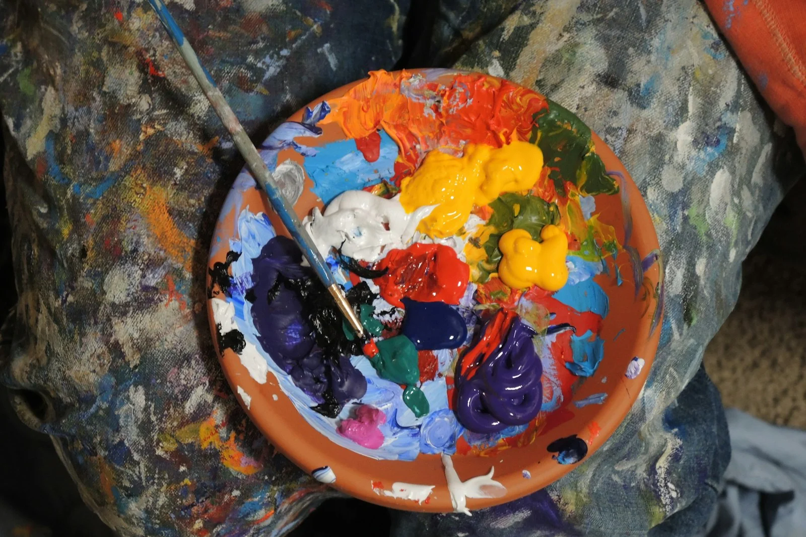
A certain parent once told me that their child didn’t want to read an illustrated book - even though the drawings were professional. The problem? The illustrations were kept in a dark, gloomy colour palette that put the young reader off. Colours are a powerful tool of communication with a child’s mind. The right choice of tones makes a child reach for a book eagerly - wrong choices can put them off even an interesting story.

Why colours are so important in children’s books
Children perceive the world differently from adults. Their developing brain reacts to colours much more strongly. Research into the psychology of colour shows that the right tones support concentration, improve mood and help with remembering content - knowledge I constantly use in children’s illustration.
An adult can admire a monochrome illustration, appreciating its artistry. A child will look once and turn the page. Not from a lack of taste - for neurological reasons. A child’s nervous system needs more visual stimulation, more contrast, more colour, to hold attention.
Colours act as an emotional guide - they help a child understand the mood of a scene even before reading the text. Bright tones signal positive situations. Darker tones can foreshadow tension or sadness. Red warns. Green calms. These associations are partly innate, partly learned through contact with culture - but for a child they work very strongly.
That’s why in children’s illustration there are no neutral colours. Every tone communicates something, every shade suggests something. A conscious illustrator chooses colours the way a composer chooses notes - with the final effect in mind.
How children perceive colours - differences by age
A child’s age is fundamentally important to the choice of palette. What fascinates a two-year-old will bore a seven-year-old. What delights a preschooler, a ten-year-old will consider infantile. Ignoring age is one of the biggest mistakes of beginning authors.
Infants up to 2 years. They respond best to contrasts (black with white, red with white). Vision is only developing - in the first months an infant sees mainly in shades of grey, colour appears gradually. Books for the youngest should have large, clean patches of colour, minimal detail, strong contrast of figure and background.
Children 2-4 years. They love bright and saturated colours (vivid reds, yellows, blues, greens). They support the development of visual perception. Books for this group can have a lively, almost cartoon palette - but in moderation, so as not to tire the eyes.
Preschoolers 4-6 years. They appreciate more complex palettes, though they prefer warm tones. They start to understand the symbolism of colours. They know that red is a warning, that blue is calm. You can already offer them subtler solutions, combinations, nuances.
Children 7-10 years. They have fully developed colour perception and can appreciate advanced, artistic palettes. Books for this group can experiment with muted, monochrome, unconventional palettes. A reader of this age can already appreciate that the illustrator chose a specific aesthetic.

Warm colours - energy, joy, safety
Warm colours are the foundation of children’s illustration. The sun, fire, human warmth - all these associations work strongly and positively on a child.
Red. The colour with the greatest power of impact. Bright shades work encouragingly. Dark ones can be overwhelming - especially for younger children. Red draws the eye like no other colour - the brain reacts to it evolutionarily as a signal (ripe fruit, blood, a warning). In children’s illustration I use it sparingly, as an accent.
Orange. It combines energy with joy, less aggressive than red. Ideal for creating an atmosphere of cosiness and homely warmth. An orange world is the world of sunset, autumn pumpkins, fire in the fireplace - all positive associations.
Yellow. The colour of the sun and joy, but tricky in use. Large areas of yellow can tire the eyes - it’s better to dose it and combine it with other tones. Yellow great for highlighting the most important elements, but as a background it lasts only briefly.
Browns and beiges. They give stability and natural warmth. Great for building a sense of authenticity and cosiness. Browns are wood, earth, animal fur - colours of nature that calm and tap into sensory memory.
Cool colours - calm, melancholy, mystery
Cool colours stand in opposition to warm ones, but they’re not worse - they’re different. They serve different narrative purposes.
Blue. Bright blues are associated with freedom and adventure (the sky, the sea). Darker shades introduce mystery or evening calm. Blue is the most universal cool colour - most children accept it, even if they prefer warm palettes.
Green. The colour of nature and harmony. Bright greens show nature and health. Dark ones introduce mystery, forest, depth. A green world is a safe world - children associate green with grass, trees, the park.
Purple. Associated with magic and fairy-tale. Bright shades are calm, dark ones mysterious - ideal for fantasy. Purple is the wizard’s colour in children’s imagination - they see it in fairy-tale illustrations and transfer the association to every scene with purple accents.
Cool colours in large doses can overwhelm, especially younger children. It’s worth combining them with warm accents. An illustration that’s 80 percent blue can work depressively - the same illustration with the addition of yellow windows in a house becomes cosy despite the dominance of blue.
Contrasting vs harmonious colours
This is one of the most important design decisions: contrast or harmony?
Contrasting colours (red with green, blue with orange, yellow with purple - opposite on the colour wheel) draw attention and clearly highlight important elements. A child’s brain notices contrast instantly - it’s a primal mechanism serving the evolutionary recognition of shapes. But an excess of contrasts leads to visual chaos - the child doesn’t know what to focus on, attention scatters.
Harmonious colours (close to each other on the colour wheel - red with orange, blue with purple, yellow with green) work calmingly and create a sense of order. They work great as a background, as a dominant palette, as the foundation of an illustration.
The greatest art is balance: a dominant harmony with contrasts highlighting the key elements. This builds a visual hierarchy. A character in a red jacket against a harmonious green-blue landscape - the child’s eye finds them instantly, because red is a contrasting accent. If the whole landscape were full of clashing colours, the character would disappear into the chaos.
The most common colour mistakes
Over the years I’ve seen many illustrations that, despite good composition and drawing, didn’t work. Usually the problem was in the colours.
Too many saturated colours at once. An excess of intense tones overwhelms and tires the eyes. An illustration in which every element has a maximally saturated colour loses its hierarchy - everything shouts equally loudly. You have to choose what’s an accent and what’s a background.
Ignoring the readers’ age. A palette for a two-year-old can be infantile for a seven-year-old, and vice versa. A ten-year-old’s palette can be too muted for a three-year-old.
A lack of colour consistency. Every illustration has a different palette - this creates chaos and destroys the sense of a world. The reader doesn’t know whether they’re still in the same book. A consistent palette throughout the book is one of the biggest factors of quality.

Unconscious use of colours with negative associations. Dark greys or aggressive reds can evoke anxiety in younger children. You have to decide consciously when to use them and why. A sad scene may need greys - but a calm scene shouldn’t have them.
Neglecting the background. A monotonous background doesn’t support the mood of a scene and lowers the quality of the whole illustration. The background is 70 percent of the surface - it can’t be random. Every background tone communicates something extra.
Copying adult palettes. What works for older readers may not suit children. The fashionable adult palettes - muted, beige, monochrome - are often boring for a child. The same principle applies to product illustration on packaging aimed at children - a palette from an adult aesthetic won’t work.
Imitating the competition. Because a bestseller looks like that doesn’t mean your book has to look like that. Every story has its own palette. Copying makes a book disappear in a sea of similar ones.
Practical tips for authors
If you’re writing a book yourself and will commission the illustrations:
- think about the age of the target readers when choosing the palette - it’s the first question
- consider the mood of the story and the colours that convey it
- ask for colour samples before the final approval
- trust your intuition, but stay open to the suggestions of professionals
- test the illustrations on children from the target group, if possible
- don’t choose colours based on your own aesthetic preferences
- don’t suggest your favourite colours to the illustrator if they don’t fit the story
A good illustrator will propose a palette at the start of the project - or a few variants to choose from. This is the moment to stop, look, think it over. A palette chosen once will stay with the book forever - later changes are very hard.
Palette and the emotion of a scene
Every scene in a book has its dominant emotion. The illustrator has to choose colours that reinforce that emotion, not suppress it.
Typical scene-palette pairs:
- a joyful outdoor scene - bright blues, lush greens, yellow accents
- an evening scene at home - warm oranges and browns, soft shadows
- a mysterious scene in the forest - deep greens, purples, one point of light
- a scene of sadness - muted greys, accents of cold blue
- a scene of fear (gentle) - cool purples, dark patches, contrast
- a scene of hope - the first rays of warm light in a dark palette
- a scene of a burst of joy - an explosion of clean, saturated colours
None of this is a rule - these are guidelines. Every good illustration can break conventions. But breaking them consciously is something different from breaking them out of ignorance.
Colours and culture - local readings
It’s worth remembering that the symbolism of colours is not universal. A book meant only for the Polish market can use Polish associations without thinking. A book designed with translations or multicultural audiences in mind requires more awareness.
In Polish and European culture:
- white - purity, holiness, weddings
- black - sadness, mourning, gravity
- red - love, danger, energy
- green - nature, freshness, a beginning
In other cultures the associations can be completely different, which is described in detail by colour theory in its cultural variant. White in many Asian cultures is associated with mourning. Red in China symbolises happiness and prosperity. Gold in Buddhist cultures has a sacred meaning.
For children’s books distributed mainly in Poland these nuances rarely matter. But if you’re writing a book with translation in mind, or for children from different cultural backgrounds, awareness of the cultural flexibility of colours is valuable.
Colours are emotions
Colours in children’s illustration are not aesthetics - they’re emotions and ways of communicating. A conscious choice of palette makes a book noticed and loved. Every colour carries an emotional charge that a child’s brain receives more intensely than an adult’s.
The most important thing, however, is that colours serve the story and don’t distract from it. The right palette, chosen with children’s needs in mind, can make an illustrated children’s book become a treasure for life. A book you return to after years. A book that a child, now grown up, shows to their own child.
Working on a book’s palette is work worth investing time in. It’s an invisible layer that no one consciously notices - but that everyone feels. And which decides whether a child reaches for a book eagerly, or puts it down after the first page.
Planning an illustrated book? Write to me - I reply within 48 hours.
More in illustration
All illustration →
Illustration
How to publish a children's book - the complete guide
What you need to know to publish a children's book - publisher vs self-publishing, editing, illustrations, print, ISBN, distribution and promotion. Step by step.
Illustration
How to prepare a brief for an illustrator - a guide for authors
The brief is the foundation of working with an illustrator. What it should contain, what to avoid, how to describe characters and scenes - a practical guide for children's book authors.
Illustration
The 5 most common mistakes when commissioning book illustrations
Commissioning illustrations is a process full of traps. The 5 most common author mistakes and concrete solutions - from the perspective of a children's book illustrator.
Start a project
Got a project? Let's talk.
I make art that stays - with emotion and attention in every project. Children's book illustration delivered worldwide, wedding and B2B event live painting across Poland - every project starts the same way: an inquiry, a conversation, a decision. Write to me directly. The Bujnowłosa studio is me and a decade-plus of practice.