
Illustration · 12 min read
The process of creating book illustrations - from sketch to final version
The whole book illustration process in 7 stages - from immersion in the text to final print files. Why good illustrations take time.
· Anna Karwala
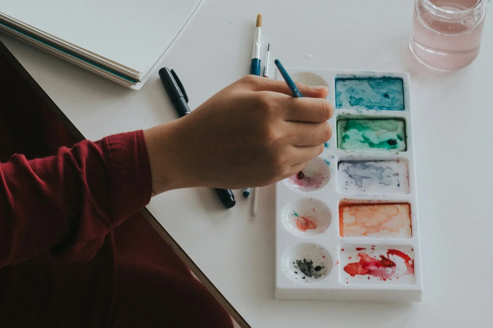
People sometimes think a book illustration is “just a picture”. After almost a decade in this profession I can say - it’s much more. Every illustration is created in a seven-stage process that’s hard to speed up without losing quality. I’ll show you how it looks with me - step by step, with concrete examples and an explanation of why each stage matters.
Why an illustration is not “just a picture”
Before I show the specific stages, I have to explain why you can’t make an illustration quickly and without a plan. This question comes up often, especially from people commissioning illustrations for their book for the first time.
A book illustration has many tasks at once
Unlike a picture in a gallery, which can express the artist’s pure emotions, a book illustration has to simultaneously:
- tell part of the story visually
- characterise the characters consistently throughout the book
- build the world presented in the text
- communicate with a specific audience
- work stylistically with the other illustrations
- support the page layout and typography
- work both in large format and in a thumbnail
It’s a bit like juggling five balls at once. Plus a few extra ones you don’t see at first glance.
The best ideas rarely come right away
From my experience I know that the first idea is usually obvious and shallow. The brain offers the simplest, most literal solution - the character stands in the centre, the scene is head-on, the composition symmetrical. Only further iterations let you discover solutions that make an illustration special and stick in the memory.
The ideas that come third, fourth, fifth - are usually better. Because they required thought. They required rejecting the obvious and searching for something that says the text in an unobvious way.
Illustrations made “quickly” are usually forgotten. Those that went through the whole process work on readers for years.
Stage 1: immersion in the text
It all starts here. Not with drawing, but with a deep understanding of the story. This stage usually takes a few days, regardless of the length of the text - because it’s not about reading quickly, but about soaking it up.
Reading with an illustrator’s eyes
When I read a text, I see it differently from an ordinary reader. The reader reads for the plot. I read for the images. I look for key moments of action worth showing visually, descriptions of characters and places, the characters’ emotions. But also the things the author didn’t write outright - the silences that an illustration can fill in.
Sometimes the best illustration shows what’s not in the text. The character looks out the window, and in the background you can see something the text says nothing about - but which adds layers to that scene. That’s the moment when an illustration stops being a decoration of the text and becomes its extension.
Asking the right questions
After the first reading I always have a list of questions for the author:
- how do you imagine the main character?
- are there scenes you particularly want illustrated?
- what do you absolutely not want to see in the illustrations?
- what mood should the book have, in your view?
- which illustrations from other books do you like and why?
These questions often reveal things the author had in their head but didn’t write down. It often turns out they have a very specific vision of the world or characters that didn’t make it into the text, but is key to illustrating the story properly. Without that conversation I’d start the work blind.
Stage 2: frame proposals
After the conversation and getting to know the expectations, I present my frame proposals. This is the moment when theoretical talks about the book translate into concrete visual solutions.
Choosing the scenes to illustrate
I choose the moments best suited to showing visually - this applies especially to children’s illustration, where every frame has to be justified. It’s a stage similar to creating a storyboard in film - we plan the rhythm of the visual narrative. Not every scene from the book needs an illustration - what matters is choosing the ones that:
- best convey the mood of the story
- show key moments of action
- characterise the main characters
- build the presented world
- spread evenly across the whole book
- give a varied visual rhythm (close-up, mid shot, wide shot)
Planning the composition
For each chosen scene I think about the best way to present it. Does the scene need a close-up on the characters’ emotions, or rather a wide shot showing the whole surroundings? Should the character look at the reader or turn their gaze away? Is the composition dynamic (diagonal lines, movement) or static (horizontal lines, calm)?
Most often the solutions that work are the ones that didn’t come to mind first. The first ideas are obvious - the character in the centre, the scene shown head-on. The second and third ideas start to be interesting. The fourth and fifth are often breakthroughs.
Stage 3: detailed sketches
After the frame proposals are approved, I move on to working out the details. It’s like moving from an architectural project to interior design - the general layout is ready, now you fill it in with execution.
Characterising the characters
Every character has to look the same throughout the book. I create a “character sheet” for them:
- body proportions - tall or short, slim or rounded
- characteristic features - a scar, a birthmark, eye colour, hairstyle
- typical expression - whether they smile more often, frown, are serious
- clothing - whether they have a fixed item of dress
- accessories - glasses, a hat, a backpack
Often one characteristic trait of a character (the way they dress, their hairstyle, a favourite object) becomes their recognisable mark that readers remember. The same goes for side characters - even if they appear only once, they have to have character, not be generic silhouettes.
Building the environment
The places in the book also have to be consistent. If the action happens in the same house, every illustration has to show the same furniture, wall colours, window placement. I keep an eye on this constantly so as not to get lost in the successive illustrations.
I usually create a sketch of a room from different perspectives - a view from the door, from the window, from above. This way the interior is consistent in every illustration, even when I show it from a different angle.
Stage 4: colour studies
Before I start painting, I have to think through the colours of the whole book. This is not an ad hoc decision for each illustration - the colours have to be planned in advance, like a score for the whole piece.
Creating the book palette
Every book should have a characteristic palette - a set of colours running through all the illustrations. It’s the palette that gives the book a coherent mood and makes it recognisable. Turning the pages, the reader subconsciously feels that all the illustrations belong to the same world.
Examples of typical palettes:
- a fairy tale about autumn adventures - golden yellows, warm browns, deep greens, an accent of red
- a story about a sea voyage - various shades of blue, white and coral accents
- a story about friendship - pastel pinks, purples and mints
- a thriller for teenagers - cool greys, accents of burgundy and deep navy
- a fairy tale about a forest - greens, browns, moss, ferns, accents of mushroom red
The palette doesn’t have to be narrow - it can have 15-20 colours, but each of them has to match the rest. A bigger problem is a book with a palette of “any colours”, where every illustration looks like it comes from a different book.
Stage 5: final illustrations
This is the most time-consuming, but also the most satisfying stage. Here all the earlier arrangements come together into the final image.
Building the illustration from scratch
I create each illustration gradually - from the general outline to the final details. Working in layers lets me control every element and introduce corrections at the right stage, before it’s too late.
A typical layer arrangement:
- general sketch - composition, main elements
- background - the further planes, the general atmosphere
- mid shot - elements of the immediate surroundings
- characters - silhouettes, clothes, accessories
- faces - features, expression, eyes
- details - refining the specifics, textures
- lights and shadows - adding depth
- final refinement - colour accents, minor corrections
Controlling consistency
During the work I constantly compare the new illustration with the previous ones:
- does the character still look the same?
- do the colours match the set palette?
- does the style remain uniform?
- are the proportions kept?
A technique I use. I create a “control board” with fragments of all the illustrations. When I see them next to each other, I immediately notice the inconsistencies. A character looks older in one scene? Shoes have a different colour in another? The control board catches it instantly.
Maturing time
I set every finished illustration aside for at least one day. Fresh eyes let me notice things that slipped by during intensive work. Sometimes the illustration needs additional work. And sometimes it turns out better than I thought.
It’s a moment that can’t be rushed. The brain needs a break to see the work from a distance. Working non-stop, you lose the critical view. Coming back the next day, you see the work like someone new - and that’s often the moment when it’s clear what really needs fixing.
Stage 6: corrections and refinements
Corrections are a normal part of the process, not a sign of failure. Illustrations are often accepted right away, but feedback is valuable too.
Types of comments
From authors:
- “Can the character’s facial expression be changed?”
- “Can the background be brighter?”
- “Can some element be added?”
- “Can the character look in another direction?”
From publishers or editors:
- “Is this scene legible for the target age group?”
- “Does the illustration work with the page layout?”
- “Can more room be left for text?”
How I approach corrections
I analyse every comment: whether it really improves the illustration, whether it’s technically possible, whether it won’t spoil other elements. If a correction seems problematic to me - I explain why and propose alternatives.
The worst corrections are those made mechanically, without thought. The author says “change it”, and I change it without thinking - and it turns out the first version was better. That’s why I talk. I ask why you want it that way. What doesn’t fit. What you want to achieve. Sometimes it turns out the problem is solved by a different correction, not the one the author proposed.
Stage 7: preparing the final files
The last stage is preparing the illustrations for print or digital publication within full graphic design. More technical, but equally important:
- I check the resolution (300 DPI minimum for print)
- I verify the colour profile (CMYK for print, RGB for screen)
- I set the file format (TIFF, PSD, PDF depending on need)
- I control quality - whether there are no accidental smudges, whether the colours are consistent
- I add bleed where the illustration is meant to “run off” past the page edge
- I archive all versions
I archive all versions - from the first sketches to the final files. The client often needs modifications later - for a second edition, for merchandise, for promotion. With an archive, I can quickly pull out the needed files without recreating the illustration from scratch.
Why this process pays off
You might think: “this is complicated, can’t it be done simpler?” It can. But at the cost of quality.
Illustrations done quickly show right away - they have problems with composition, lack consistency, don’t convey the mood of the text. Characters look different in different scenes. The background is random patches of colour. Detail is missing. The book gets published, but a year later no one remembers its illustrations.
Illustrations from the full process serve the story perfectly, stick in the memory, keep their freshness for years. A child who grew up with an illustrated book returns to it after twenty years and remembers every picture. That’s the goal.
From my experience, projects done in a rush, though technically correct, lack the soul that makes an illustration stay with the reader for a long time. Projects with the full process get better reviews and are more readily recommended.
What this means for authors
Planning the time
A good illustration needs time to mature. You can’t predict to the day when it will be ready. What you can do:
- plan the project with a big time margin (3-6 months for a book with 20 illustrations)
- be flexible about deadlines
- in case of delays, demand clear communication
- don’t commission at the last minute before a specific deadline (launch, fair)
Understanding the process
Every stage has its justification. When an illustrator shows sketches, it doesn’t mean they can’t draw the final version right away. It means they want to achieve the best result. A sketch is a consultation, not a demonstration of skill.
An investment in the future
A good illustration process is an investment in the long-term success of the book. Illustrations made with full care will serve for years and build a positive opinion of your writing.
Art needs time
The biggest lesson from almost 10 years of illustrating is that haste is the biggest enemy of good illustration. The best ideas come in their own time, and the most beautiful images are created through patient building, layer by layer.
When you see a final illustration in a book that seems natural and obvious, remember - behind it stands a whole process of searching, experimenting and refining. It’s no accident that some illustrations stay with us for years.
Planning an illustrated project? Write to me - I reply within 48 hours.
More in illustration
All illustration →
Illustration
How to publish a children's book - the complete guide
What you need to know to publish a children's book - publisher vs self-publishing, editing, illustrations, print, ISBN, distribution and promotion. Step by step.
Illustration
How to prepare a brief for an illustrator - a guide for authors
The brief is the foundation of working with an illustrator. What it should contain, what to avoid, how to describe characters and scenes - a practical guide for children's book authors.
Illustration
The psychology of colour in children's illustration
How colours affect children's reception of illustrations. Warm and cool tones, contrasts, a palette by age - a practical guide for authors.
Start a project
Got a project? Let's talk.
I make art that stays - with emotion and attention in every project. Children's book illustration delivered worldwide, wedding and B2B event live painting across Poland - every project starts the same way: an inquiry, a conversation, a decision. Write to me directly. The Bujnowłosa studio is me and a decade-plus of practice.