
Illustration · 8 min read
Organising the workspace through an illustrator's eyes
How to organise an illustrator's studio in a small flat - separating work from rest, desks, cabinets, lighting. Practical tips from experience.
· Anna Karwala
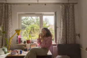
For years I lived in multi-room flats where I had whole rooms for a studio. Then I came to Krakow and ended up in a shared one-room flat. After a lot of trial and error, my workspace finally works. I’ll share what worked for me - because organising an illustrator’s studio is not a topic from an interiors magazine, but a daily work tool that either supports the work or sabotages it.
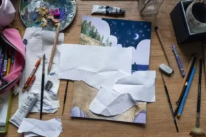
The Louvre, Versailles, or a sofa bed with a laptop tray
Everyone starts from a different level. My room in the family home was sizeable - you could set up two desks, shelves, cabinets with materials. I had a separate computer corner then, a separate place to draw, a separate study space. In Krakow I had a square metre for a desk and nothing more.
Both situations require different thinking, but the basic principles are the same. Whether you have a full studio with easels or a corner of a desk in the bedroom - what counts is how consciously you manage what you have. The most beautiful studio without a system will turn into chaos in two weeks. The smallest corner with a good plan can be productive for years.
In high school, when I still lived with my parents, I had the comfort of two extra rooms after my older brothers moved out. I had a separate room with a computer, a separate painting-and-drawing room with easels and palettes, and my own bedroom for studying. Back then I didn’t know how unusual that situation was.
A clear division - sleep vs work
Separating the work and rest zones is crucial. Not only because the bed will distract us during work, but also the other way round - the bed, sleep and rest can start to feel like work and make it harder to fall asleep. This is one of the most serious mistakes I’ve noticed in friends who work from home.
The brain learns associations. If you spend a week writing emails in bed, the bed starts to feel like work and tension. After a month you can’t fall asleep, despite being tired. After six months you need a sleeping pill. It sounds dramatic, but that’s how it works - and I know a few people who reached that point.
When space is scarce:
- make the bed properly every day, ideally right after getting up
- tidy household items into cabinets so the studio doesn’t look like a bedroom
- put the desk as far from the bed as possible, ideally with your back to it
- use a screen or shelf as a partition wall - even visual separation helps
- if you have separate rooms, use different lighting - warmer for sleep, cooler for work
How to organise the space - the table method
A proven setup is two separate desks (even small ones), placed at an angle, not side by side. Experience has taught me that desks joined in a line act like one big table - and then the chaos spreads across the whole surface. It’s better to separate them, even by half a metre.
Assign specific tasks to each surface:
- one desk - traditional drawing, book illustrations on the graphics tablet
- the other desk - laptop, paperwork, communication with clients
Keeping these boundaries prevents the mess from spreading. When I’m sketching, I’m not tempted to glance at emails every five minutes. When I’m working on the computer, I don’t drench the laptop in watercolour. Each surface has its function - simple, but effective.
Alternatively - one neutral work table for flexible tasks and one orderly desk for specific projects. This solution is for people who prefer one central point and one archive spot. The number of tables can be adapted to your needs - two are enough for most.
In middle school I worked entirely without a desk, doing homework on the carpet, the balcony or in the garden. Back then I didn’t need infrastructure. Now, when I illustrate commercially, infrastructure is essential - but simple. I don’t need designer desks costing a fortune, I need two stable surfaces with good lighting.
Desk and cabinets - what to keep where
Things used daily stay on the desk, within reach. Less frequent materials go into cabinets. The most important thing: don’t buy organisers before you’ve identified what you need to organise. That was my biggest lesson.
For years I bought beautiful boxes, binders, trays for various odds and ends - “just in case”. The result? Every box turned into a black hole for random objects. I’d put in pens I never used, paint samples I didn’t need, leaflets from shops. The boxes grew, the desk clogged up.
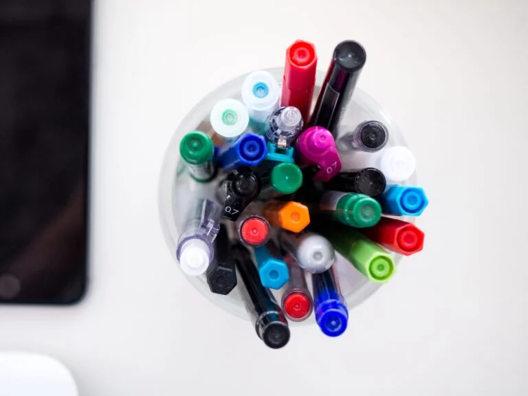
Now I do the opposite. First I observe for a week what I actually use. Then I choose an organiser tailored exactly to the need. It can be the cheapest box from Ikea - what matters is that it has a purpose and that everything that goes in makes sense.
Use thematic sets. I keep all the mug-painting materials in one box - paints, brushes, primers, sandpaper. And separately a box with paints and papers for custom portraits - I take it out only when I need it. It simplifies the work a lot. I don’t have to search for “that specific paint” through ten drawers - I know exactly where the whole set for a given type of project is.
Stowed materials and sketchbooks - the paradox of stowing
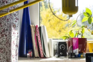
So that materials don’t become invisible, put your sketchbooks on the windowsill or a visible shelf away from the main desk. It’s a paradox: we stow things away to keep it tidier, but some stowed things become forgotten.
Sketchbooks are a classic case. When I put them away in the cupboard, I don’t pick them up for a month. When I see them on the windowsill - I reach for them daily. The awareness that they exist acts as a reminder. They’re also a nice decoration - my old sketchbooks from different periods of my work are like a photographic archive I want to see.
The same principle applies to inspirational materials. Art books, albums with other artists’ illustrations, colour samples of favourite palettes - if I hide them in the cupboard, they don’t exist in my daily work. If I put them on a shelf above the desk, I reach for them regularly and they influence what I create.
Minimalism or a kingdom of trinkets
Preferences are individual. In my place there are plants, illustrations, figurines, lamps, soft toys - but in a way where the decorations don’t intrude on the desk’s functionality or distract excessively. The line is thin and everyone has to draw it themselves.
I tried strict minimalism - clean white surfaces, only the essential tools, no decorations. After two weeks I started to feel like I was in a dentist’s office. I missed the warmth, the character, something to rest the eyes on.
I also tried the opposite extreme - all my favourite objects, lamps, plants, posters everywhere. After a month I noticed I couldn’t focus. Every gadget was clamouring for attention.
The golden mean is targeted decoration: a few plants in one place (not all over the room), one frame with a special illustration on the wall (not a gallery), ambient lamps only in one zone. A decoration should be pleasant, not fight for priority with the work.
A view from the window or a white wall
Looking out the window rests the eyes by focusing on distant objects. It’s a basic principle of visual work hygiene - the so-called 20-20-20 rule, where every 20 minutes you look at something 6 metres away for 20 seconds. If you have a window in front of you, you do it automatically. If a wall - you have to remember.
It also gives relaxation through observing nature, the street, the sky. For me, observing greenery and birds is important, especially since an illustrator’s work can be stressful and static. The brain needs breaks, and a window provides them naturally.
But this too is an individual choice - some people focus better facing a white wall, with no stimuli from outside. I know illustrators who deliberately set the desk with their back to the window, because the sight of movement on the street distracts them. Every solution makes sense if you choose it consciously.
A third variant: the window to the side. Light from the side gives even illumination of the work surface and at the same time lets the eyes rest when you turn your head. This is my current setup and it works best of all my attempts so far.
Lighting - an underrated aspect
Good lighting is an investment no one regrets. A studio with poor light tires the eyes within two hours. A studio with good light lets you work eight hours without a headache.
Three sources are the minimum:
- general (ceiling, bright, neutral) - for overall light in the room
- a spot over the desk - strong, directional, for detail work
- ambient (lamps, candles) - for adjusting the atmosphere, for breaks
The colour of the light matters. For colour work you need neutral light (about 5000K - the so-called colour temperature), which renders colours faithfully. Warm light tints everything yellow, cool light blue - and your illustrations will look different in daylight than during the work.
Working from home - the professional and private boundary
I return to the topic of zone separation, because it’s a common problem for people working in home office mode. A studio in a flat requires not only physical separation of zones, but also conscious work with the rhythm of the day.
A few things that worked for me:
- set working hours and stick to them - the brain needs a rhythm
- dress “for work”, even if no one sees you - it’s a signal to the brain
- take breaks outside the studio - go to the kitchen, the balcony, for a walk
- when you end the day, physically leave the studio and close the door (if possible)
- treat weekends like weekends - if the studio is part of the flat, it’s easy to “just take a quick look”
The boundary between work and life doesn’t exist in space - you have to create it yourself. A studio that works is one you enter into work mode automatically and one you can leave without pangs of conscience.
Materials - how not to drown in supplies
One of the biggest problems for illustrators is accumulating materials. Every new technique tempts with new tools. Every new project requires new colours, papers, brushes. After a few years the flat starts to resemble an art shop.
My rules, which work:
- buy only what you specifically need for the current project
- don’t buy “just in case” - it usually lies unused
- do an inventory once a year and get rid of what you haven’t used in 12 months
- keep the more expensive materials (professional watercolours, good brushes) in one place with care
- cheap consumable materials (sketching paper, pencils) can lie around more loosely
An important observation - the more materials you have, the less you use them. It sounds paradoxical, but it works. With 30 watercolour colours, you reach for the same 8 favourites over and over. With 8 colours, you use them all. Limitation forces creativity and makes decisions easier.
Summary - the space evolves with you
Organisation requires time and patient observation of your own habits, the rhythm of your day, your needs. We arrange the space for ourselves - for our strengths and weaknesses - and not for a rigid image of the “ideal” studio, which doesn’t exist anyway.
No single approach works universally. Flexibility and self-observation are key. The studio evolves along with what you currently do, how long you work, which tools you use. I didn’t come up with mine in this form right away - it’s the result of many years of experimenting, making mistakes, buying things I later regretted, and discovering solutions I’d never have expected.
There’s no ideal studio. There’s only a studio that works for you now, at this stage of life and career. In a year it may need rebuilding. In five years it may be completely different. That’s good - it means you’re growing.
Have a question about my work or a project? Write to me - I reply within 48 hours.
More in illustration
All illustration →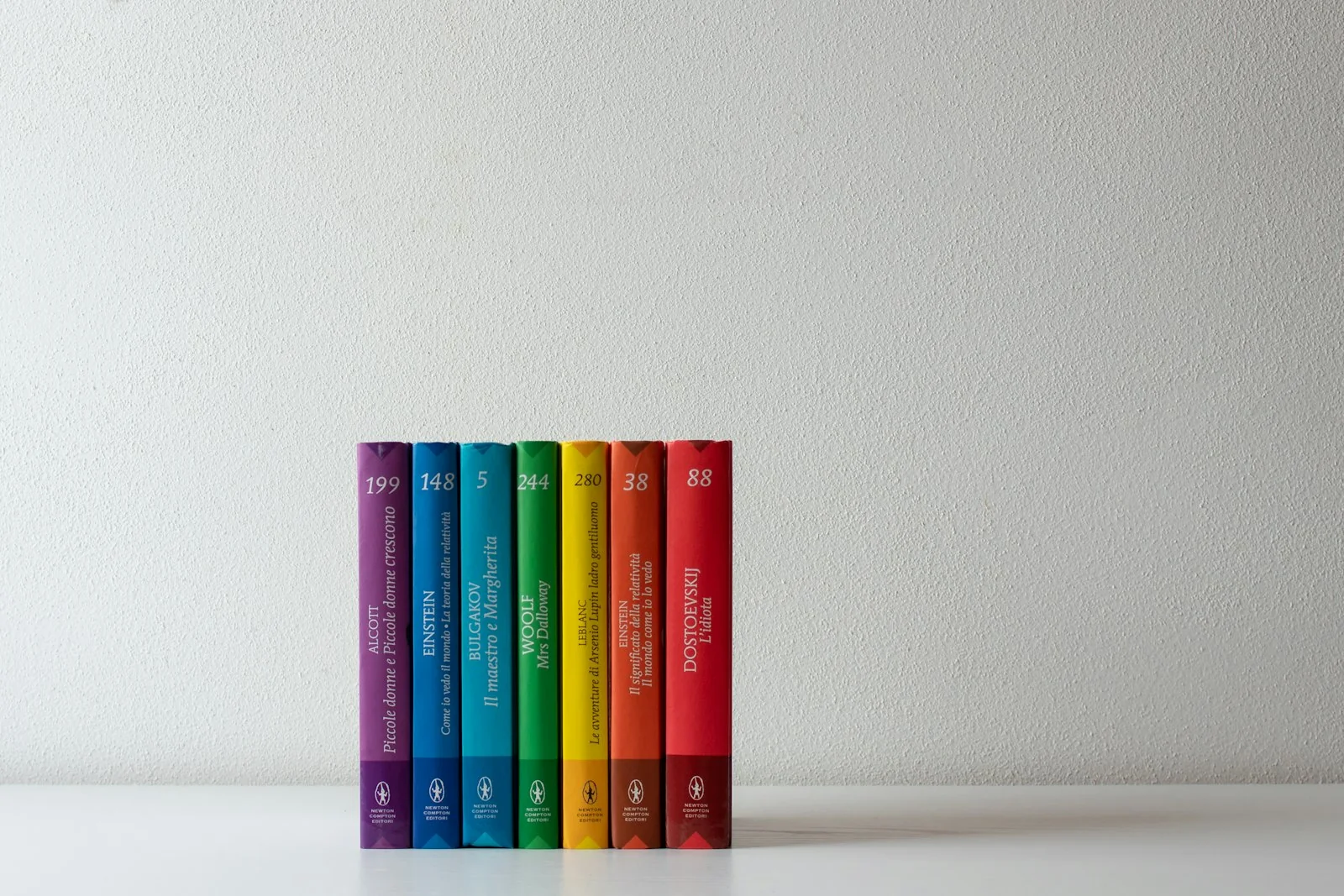
Illustration
How to publish a children's book - the complete guide
What you need to know to publish a children's book - publisher vs self-publishing, editing, illustrations, print, ISBN, distribution and promotion. Step by step.
Illustration
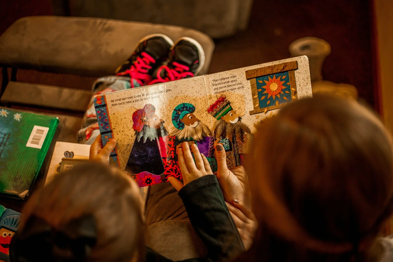
How to prepare a brief for an illustrator - a guide for authors
The brief is the foundation of working with an illustrator. What it should contain, what to avoid, how to describe characters and scenes - a practical guide for children's book authors.

Illustration
The psychology of colour in children's illustration
How colours affect children's reception of illustrations. Warm and cool tones, contrasts, a palette by age - a practical guide for authors.
Start a project
Got a project? Let's talk.
I make art that stays - with emotion and attention in every project. Children's book illustration delivered worldwide, wedding and B2B event live painting across Poland - every project starts the same way: an inquiry, a conversation, a decision. Write to me directly. The Bujnowłosa studio is me and a decade-plus of practice.